


Cross-Platform UI/UX Design Project for Managing Bipolar Disorder Symptoms.

Stable 2022
UI/UX Design Case Study
Stable is an IOS app for Bipolar disorder symptom management. Designed to identify early signs of a Bipolar episode to forestall relapse and maintain overall wellbeing. Based on personal moods, behaviours and habits, with full customization capabilities.


I developed Stable as my Capstone project for BrainStation’s UX Design Diploma. For this project, I designed a mobile app that’s explicitly tailored for Bipolar disorder patients, taking into account that individual lifestyles require a personalized experience that allows the users to easily track patterns indicating symptoms/triggers, allowing them to take action before things escalate into a full-blown episode.
Project Summary
Project Type: BrainStation UX Design Diploma Capstone Project
Timeline: 10 Weeks, April - July 2022
Role: UI/UX Designer (independent project)
Artifacts: Affinity Map, Persona, Experience Map, Task Flow, Sketches, Wireframes, Lo-Fi Prototype, Branding, UI Library, Hi-Fi Prototype, Marketing Website, Alternate Platform.
Skills + Methods: User Research, Interviews, Usability Testing, UX +UI Design
Tools: Otter, Figma, InVision, Illustrator, Photoshop
Platform: Mobile, iOS

Design Challenge
Statistics show that even with compliance to treatment, 70-90% of Bipolar patients experience relapse within the first 5 years of their diagnosis even with full compliance to treatment. Clinical assessments of BD symptoms are limited to subjective evaluations by clinicians, patient recall bias and poor illness insight. Consequently, objective methods for monitoring state changes are sought-after, and new tools to improve early detection and intervention in BD are in demand.

“70-90% of Bipolar patients experience relapse within the first 5 years of their diagnosis even with full compliance to treatment”
Starting off the project where the problem space was ill-defined, I engaged in the design thinking process, which is a non-linear, iterative process that’s aimed at understanding users' needs, pain points and goals, challenging assumptions, redefining problems and helps us create innovative solutions to prototype and test before coming up with a final design solution.
The design thinking process involves six phases — Empathize, Define, Ideate, Prototype, Test and Refine.
Methodology
-

Empathize
Secondary Research, Primary Research, Problem Space
-

Define
Personas, Experience Map, Opportunity
-

Ideate
User Stories, Task Flows, Inspiration Boards
-

Prototype
Concept Sketches, Mi-Fi Wireframes
-

Test
Usability Testing, Iterating, Hi-Fi Wireframes
-

Refine
Visual Identity, Hi-Fi Prototype

Empathize
Secondary Research
Exploring the problem space, I started by conducting secondary research on bipolar disorder, in general, to understand and narrow down the problem space.
Summary of secondary research findings:
BD is a common mental illness that affects 1% of Canadians
It's a lifelong condition that’s treated with, medications, lifestyle changes and psychological counselling
Even with compliance to treatment, It has a high relapse rate of 70 - 90% in the first 5 years of diagnosis
Several relapses result in poor health outcomes including loss of brain volume and structure, and metabolic syndrome.
Due to the high recurrence rate of relapse in bipolar patients, and the dangers relapse imposes on their health and well-being, I’m conducting this research to gather information on the strategies these patients utilized to avoid relapse, in an effort to find areas of improvement where I can design a solution that would potentially help them feel more confident about managing their illness.
Research Objectives
I believe that designing a solution for Bipolar patients to manage their relapse triggers, will support them in avoiding relapse of their acute symptoms.
I will know this is true when 2/3 of my interviewed participants express that difficulty recognizing and managing their triggers was the cause of an episode/relapse.
Hypothesis Statement
To address the research objectives and verify the hypothesis statement I formulated a list of assumptions which would then be either verified or disproved by conducting user interviews.
Research Assumptions
-
Easily manage their symptoms.
-
An application that helps them track their symptoms.
-
To avoid relapse of their acute symptoms.
-
If the users are not willing to use the app.
-
making the app insightful and easy to use.
Primary Research
To obtain primary data in order to validate my research assumptions, I conducted user interviews with my primary demographic. The participant criteria for these interviews was:
-
• The patient is formally diagnosed with Bipolar Disorder
• They are between the age of 20-45: a wide age range so that we can understand the causes of relapse
• They are following a treatment plan instructed by their psychiatrist/therapist/case manager
• They have a basic understanding of their illness
Recruiting Participants

To find interviewees, I made a Facebook post on Bipolar Canada, a public group where individuals can discuss anything relating to Bipolar Disorder.
The Interviews were conducted via a phone call and transcribed using Otter to facilitate gathering insights in the next steps of this research.
You can find the full interview script linked below
Key Insights
“It's still difficult for me to accept that I don't have control over my Illness”
— D.L
“I wasn't able to recognize my mania even though I knew the symptoms”
— A.J
“I wasn’t able to identify my symptoms, it was my support system that was able to figure it out from there”
— K.L

Affinity mapping is the process of extracting qualitative information from user interviews and grouping them into common themes. In my affinity mapping, 5 themes emerged for all 3 interviewees.
This helped me identify the themes with the most pain points for all participants.
Identified Themes and Insights
Chosen Theme
Even though the theme Gaining Control had the most key data points and pain points linked to it in total, it didn’t offer an actionable opportunity for intervention in itself. The question it presents is how do we help those individuals gain control?
The second most recurring theme with the second-highest pain points Identifying Symptoms offered an opportunity to design a solution to address those pain points.
For this reason, I focused on designing a solution for Identifying Symptoms.
Based on the insights from the secondary and primary research, which validated my research assumptions, I authored the question:

How might we help adults (20-45 years old) diagnosed with Bipolar Disorder feel more confident about identifying their symptoms in order to avoid full relapse of their illness?
After synthesizing all the research and understanding Bipolar patients’ pain points, motivations, and behaviours, using real user data - I was ready to develop a primary persona and experience map to highlight the key attributes of who the app users would be, and what tasks they would perform to achieve their goals.
Define
Persona
Personas are archetypical users whose goals and characteristics represent the needs of a larger group of users. They are created based on user interviews and presented with context-specific details.
For this project, I created Nikita Kiseleva, a Bipolar patient who has difficulty identifying her symptoms and wants to be aware of the warning signs before relapse so she can act on them

Experience Mapping
An experience map visually illustrates a user's needs, frustrations and perceptions as they take steps to achieve their goals. It’s a strategic process to capture and communicate the user interactions and touch points that they experience in a larger context.
The experience map provides the opportunity to find areas of intervention where the product design can be tailored to the persona’s needs.

After developing these artifacts to help me focus on the main pain points, behaviours, motivations and goals as well as identify opportunities for design intervention, I was ready to ideate the main task my app would perform.
Ideate
User Stories
A user story is an informal, non-specific explanation of an application feature written from the perspective of the target user. Its purpose is to express how the feature will bring value to the user.
To help ideate a solution that would best serve my users I authored 30 user stories based on the goals of my persona, Nikita, that focused on actions that could help her. From these stories, the following epics —an epic is a large user story that cannot be delivered as defined within a single iteration or is large enough that it can be split into smaller user stories— emerged:
Record personal data relating to symptoms
See personal information indicative of relapse symptoms
Get notified about signs of relapse
Be able to customize entry fields
Receive Reminders for Important Health Factors
Exporting Summary
For the task flow, I mainly focused on the epic of recording personal data relating to symptoms, because it was the major component of the app where most interactions would take place. The remaining epics could be added in the future.

Task Flow
A task flow is a diagram that represents a user's journey through a specific task in the app we are designing. It allows us to consider how one piece of content connects to the next and where the location screens and actions the user has to take to navigate between them are determined which prepares us for the next stages of sketching and prototyping.

UI Inspiration Board
A UI inspiration board is a collection of UI components, patterns and interactions related to our app design. They help us stay informed of what's currently trending and what established design practices work best for the users’ mental models.
I curated my UI inspiration board using InVision, collecting inspiration for the following sections:
Home screen
Recording mood
Recording meals
Recording energy levels
Recording social activities
Recording routine activities
Analytics
Home title section
Prototype
Rough Sketches
Based on the UI inspiration board, I sketched out the main screens the user would interact with to determine the interactions and flow required to complete the task of “Recording personal data relating to symptoms”. This helped me create a Mid-Fi prototype ready for user testing.


Mid-Fidelity Prototype - V1


User Testing
After 2 rounds of user testing, I prioritized the following changes using a design prioritization matrix shown below, based on the impact on the usability of the design, and the effort required to make those changes:
-
+ icon only logs single manual entries without entering daily log flowMake icons more consistent
Remove “check all that apply note” from Energy screen
Eliminate caution message at the end of the flow
Make header and footer sticky
Put “Back” button next to “Next” button
Find a clearer way to exit the flow
Replace slider with one that has a clearer scale for energy
More emotions for Mood
Fix screen titles
Add goal time for meals
Add more default meals to be logged (this should be customizable)(High Effort)
Add Calendar functionality to see/enter logs for other days
Fix welcome message punctuation
Make icons, text, and check boxes bigger
Consider adding analytics

You can find the full user testing sessions output linked below:
After implementing the changes I prioritized from the user testing session outputs, I had the final version of the Mid-Fidelity prototype ready to be developed into a Hi-Fidelity Prototype by adding colour, branding assets and Interactions
Mid-Fidelity Prototype - V3


Refine
Branding
I started the branding process by setting a list of adjectives that describe the mood/ambience of my product.
Then I created an A more than B list of keywords to identify the values of my brand. Out of which I chose 5 main keywords that define the visual experience and that set the overall tone of my digital product.

Mood Board
After identifying the keywords that represent my brand, I curated a mood board using InVision to find a style for the Hi-Fidelity design, define the colour palette, and to get inspiration for the visual identity of the brand.


Colours
Having identified the colours and keywords that describe my product, I generated a list of names that could become your brand name. These included:
- Stable
- Consistent
- Calm (found its taken by another app)
- Routine
- Succour
I ended up choosing Stable as the name of my brand because it describes what the app helps bipolar patients achieve and that is stability in their life by avoiding relapse.
Word Mark
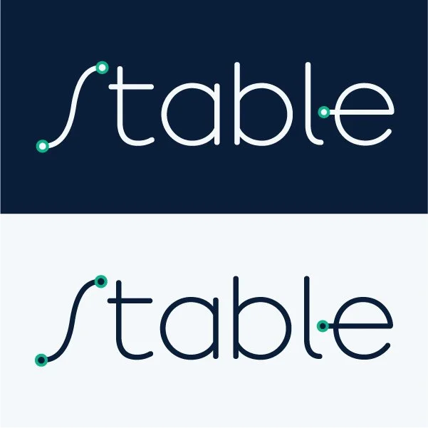
I wanted to incorporate a graph component into the word mark to reflect the main functionality of the app which is to synthesize the data the user enters to detect patterns that could lead to a relapse, which is represented in a graph form.
I chose to use Arbotek; a simple, friendly sans serif typeface that has a graph like S which worked perfectly for my word mark.
I also designed an app icon out of the S graph seen below


After enhancing the User Experience by injecting the visual identity I subsequently developed a cohesive UI Library that follows Brad’s Frost Atomic design system, entailing Atoms, Molecules, Organisms, Templates and Pages.
UI Library
Final Interactive Hi-Fi Mockup

Additional Artifacts
Marketing Website
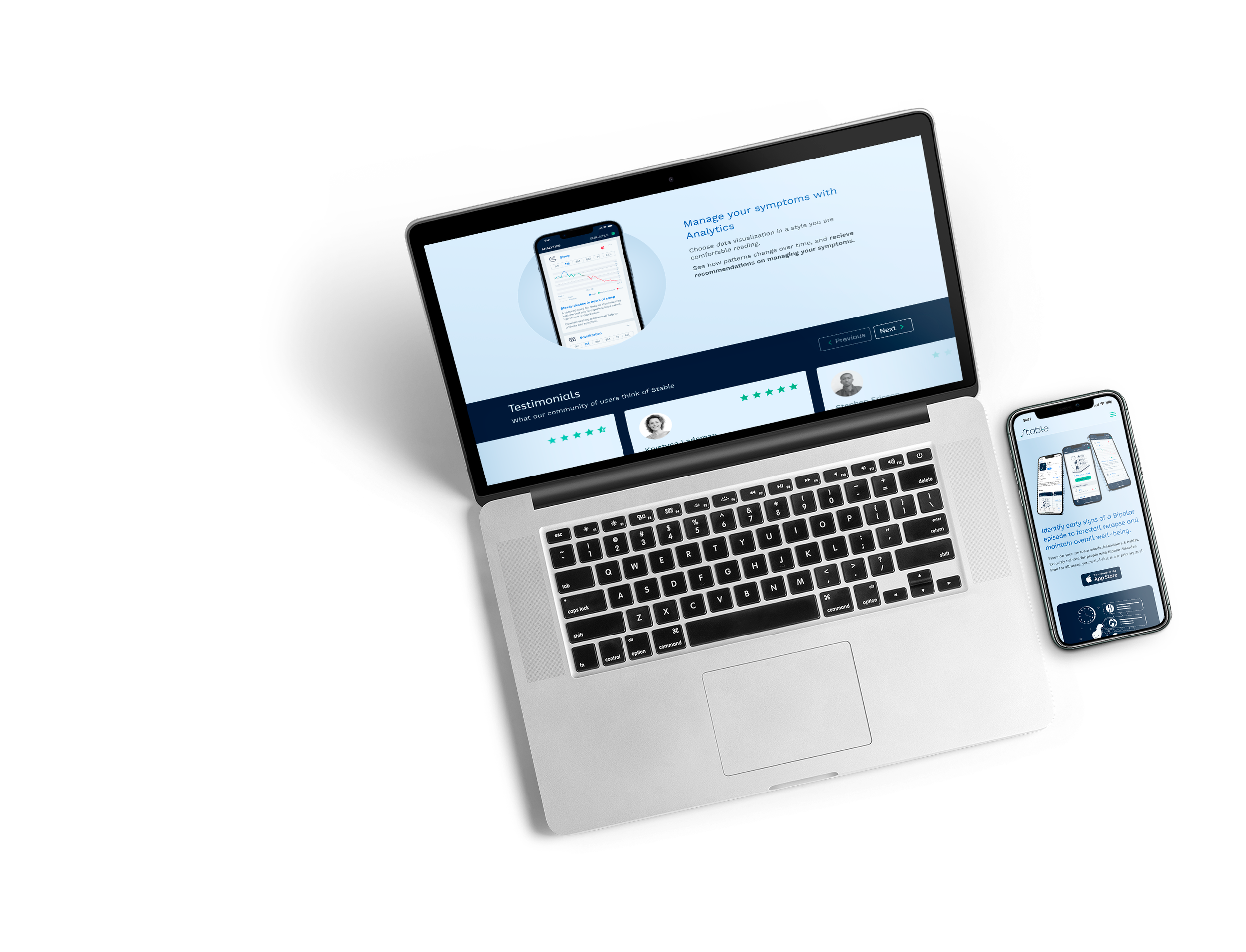
After creating a Hi-Fidelity prototype with all the branding assets, I began developing a marketing website for the digital product.
The goal of this website is to give my potential users a chance to evaluate the app and whether it suits their needs before they download and try it out. it acts as an introduction to the product and brand since its a new release.
Alternate Platform

I also designed an alternate UI for the Apple watch because it’s something the user would always have on them, so they can log their day as it goes any time without the need of using their phone which can be distracting at times. Apple watch also has additional health apps that Stable can draw information from such as the ECG and heart rate which are also useful at predicting an incoming episode for a Bipolar patient.
Key Learnings
Designing a digital solution to solve a problem is a versatile process that requires a variety of skills, we may not master all of these skills which is why seeking feedback is essential. Being open to peer input and the willingness to test and adapt our product makes the project much more solid. While explaining our approach to peers we may find gaps to be filled, and when they ask us questions they may bring up things worth reconsidering. Ultimately I learned in this project that even though it was an independent one, creating feedback loops with my peers helped a lot in shaping the final result.
As next steps for this project I would like to build out the remaining pages in the app that weren’t in the main task flow, and to prototype the personalization aspect because it's one of the main features marketed. I would also improve the UI for the app, User test it, reiterate, test again to finally prepare it for development.